from matplotlib import pyplot as plt
import seaborn as sns
import numpy as np
import pandas as pd

# Aesthetics
sns.set_style('ticks')
plt.rcParams["font.family"] = "serif" # use Serif style as default font
In [2]:
In [8]:
# Import World Bank population data for Austria and China
df = (
    pd.read_csv('../data/API_SP.POP.TOTL_DS2_en_csv_v2_320414/API_SP.POP.TOTL_DS2_en_csv_v2_320414.csv', skiprows=3)
    .drop(columns=['Indicator Code', 'Indicator Name', '2023', 'Unnamed: 68'])
    .melt(id_vars=['Country Name','Country Code'])
    .rename({'Country Name':'country-name', 'Country Code':'country-code', 'variable':'year', 'value': 'population'}, axis=1)
    .assign(year=lambda df_: pd.to_numeric(df_.year))
    .loc[lambda df_: df_['country-name'].isin(['Austria','China'])]
    .reset_index(drop=True)
)| country-name | country-code | year | population | |
|---|---|---|---|---|
| 0 | Austria | AUT | 1960 | 7.047539e+06 |
| 1 | China | CHN | 1960 | 6.670700e+08 |
| 2 | Austria | AUT | 1961 | 7.086299e+06 |
| 3 | China | CHN | 1961 | 6.603300e+08 |
| 4 | Austria | AUT | 1962 | 7.129864e+06 |
| ... | ... | ... | ... | ... |
| 121 | China | CHN | 2020 | 1.411100e+09 |
| 122 | Austria | AUT | 2021 | 8.955797e+06 |
| 123 | China | CHN | 2021 | 1.412360e+09 |
| 124 | Austria | AUT | 2022 | 9.041851e+06 |
| 125 | China | CHN | 2022 | 1.412175e+09 |
126 rows × 4 columns
In [47]:
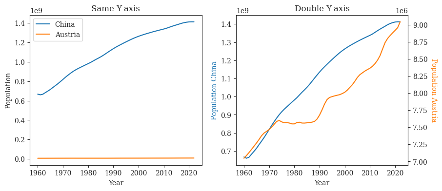
fig= plt.figure(figsize=(10,4))

ax1 = fig.add_subplot(121)
ax2 = fig.add_subplot(122)

ax1.plot(df.loc[df['country-name'] == 'China']['year'], df.loc[df['country-name'] == 'China']['population'], label='China')
ax1.plot(df.loc[df['country-name'] == 'China']['year'], df.loc[df['country-name'] == 'Austria']['population'], label='Austria')
ax1.set(xlabel="Year", ylabel='Population')
ax1.legend()

ax2_twin = ax2.twinx()
ax2.plot(df.loc[df['country-name'] == 'China']['year'], df.loc[df['country-name'] == 'China']['population'], c='tab:blue')
ax2_twin.plot(df.loc[df['country-name'] == 'China']['year'], df.loc[df['country-name'] == 'Austria']['population'], c='tab:orange')
ax2.set_xlabel("Year")
ax2.set_ylabel('Population China', color='tab:blue')
ax2_twin.set_ylabel('Population Austria', rotation=-90, va='bottom', color='tab:orange')

ax1.set_title('Same Y-axis')
ax2.set_title('Double Y-axis')
fig.savefig('../figures/double-axis.pdf', bbox_inches='tight')
plt.show()