A reference to visualize experimental variability in biological data following the SuperPlots philosophy by Samuel J. Lord et al. 2020
Author
Marco Dalla Vecchia
Published
December 6, 2024
In [9]:
# Let's import the packages we will needimport pandas as pd # essential to handle table objects (dataframes)from matplotlib import pyplot as plt # one of the most important libraries to create scientific visualization in Pythonimport matplotlib.ticker as ticker # utility import to change ticks frequency on an axisimport seaborn as sns # great package built on matplotlib to create grouped-data plotsfrom scipy.stats import ttest_rel, ttest_ind # calculate t-test between related and independent samples in Python# Aestheticsplt.rcParams["font.family"] ="serif"# use Serif style as default font
In [10]:
# Read data from original publication# find it here https://doi.org/10.1083/jcb.202001064df = pd.read_csv('../data/jcb_202001064_datas1.txt')
In [11]:
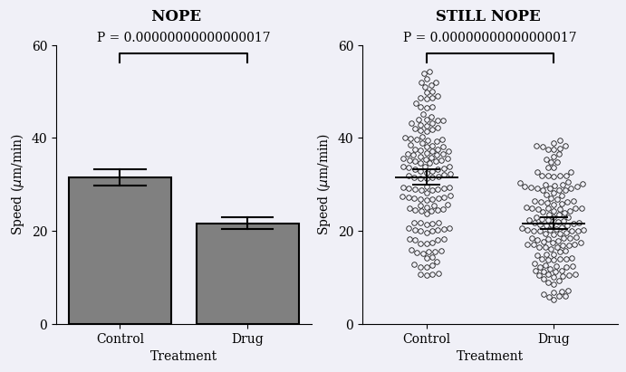
# I divided each subplot into its own function to avoid overcrowding and allow for modularity# I called each plot with its 'judgement' name in the original publicationdef create_nope_plot(df, ax):# Get 'wrong' p-value pretending Control and Drug treatments are independent samples with N=300 bad_pvalue = ttest_ind( df.loc[lambda df_: df_.Treatment =='Control']['Speed'], # all speed values for Control df.loc[lambda df_: df_.Treatment =='Drug']['Speed'] # all speed values for Drug ).pvalue# Create plot sns.barplot( # a simple barplot with errorbars grouping all the samples together data=df, x='Treatment', y='Speed', color='gray', edgecolor='black', lw=1.5, capsize=.4, err_kws={"color": "black", "linewidth": 1.5}, ax=ax )# Plot adjustments ax.set_xlim(-0.5, 1.5) ax.set_ylim(0,60) ax.yaxis.set_major_locator(ticker.MultipleLocator(20)) ax.set_ylabel(r'Speed ($\mu$m/min)') x1, x2 =0, 1 y, h = df['Speed'].max() +2, 2 ax.plot([x1, x1, x2, x2], [y, y+h, y+h, y], lw=1.5, c='black') ax.text((x1+x2)*.5, y+h*2, "P = {:.17f}".format(bad_pvalue), ha='center', va='bottom') ax.set_facecolor('#F0F0F7') sns.despine()return axdef create_still_nope_plot(df, ax):# Get 'wrong' p-value pretending Control and Drug treatments are independent samples with N=300 bad_pvalue = ttest_ind( df.loc[lambda df_: df_.Treatment =='Control']['Speed'], df.loc[lambda df_: df_.Treatment =='Drug']['Speed'] ).pvalue# Create plot sns.swarmplot( # all datapoints shown as a swarmplot not separated by replicate data=df, x='Treatment', y='Speed', size=4, zorder=0, color='#F0F0F7', linewidth=0.6, edgecolor='.1', legend=False, ax=ax ) sns.pointplot( # global errorbars considering all replicates together data=df, x='Treatment', y='Speed', linestyle="none", capsize=.2, errorbar=('ci',95), err_kws={'linewidth': 1.4}, marker="_", markersize=50, markeredgewidth=1.4, color='black', legend=False, ax=ax )# Plot adjustments sns.despine() ax.set_xlim(-0.5, 1.5) ax.set_ylim(0,60) ax.yaxis.set_major_locator(ticker.MultipleLocator(20)) ax.set_ylabel(r'Speed ($\mu$m/min)') x1, x2 =0, 1 y, h = df['Speed'].max() +2, 2 ax.plot([x1, x1, x2, x2], [y, y+h, y+h, y], lw=1.5, c='black') ax.text((x1+x2)*.5, y+h*2, "P = {:.17f}".format(bad_pvalue), ha='center', va='bottom') ax.set_facecolor('#F0F0F7')return axdef create_ok_plot(df, ax):# Actually consider the replicates# Consider mean value of each replicate per treatment# directly taken from S5 of original publication ReplicateAverages = df.groupby(['Treatment','Replicate'], as_index=False).agg({'Speed': "mean"}); ReplicateAvePivot = ReplicateAverages.pivot_table(columns='Treatment', values='Speed', index="Replicate")# Calculate 'appropriate' p-value considering n=3 good_pvalue = ttest_rel(ReplicateAvePivot['Control'], ReplicateAvePivot['Drug']).pvalue# Create plot sns.pointplot( # standard error bars of mean values of each replicate data=ReplicateAverages, x='Treatment', y='Speed', linestyle="none", capsize=.4, errorbar='se', err_kws={'linewidth': 1.4}, marker="_", markersize=50, markeredgewidth=1.4, color='black', legend=False, ax=ax ) sns.pointplot( # one dot per replicate all same color data=df, x='Treatment', y='Speed', hue='Replicate', palette=["darkgray","darkgray","darkgray"], linestyle="none", errorbar=None, markeredgecolor='k', markeredgewidth=1.1, legend=False, ax=ax )# Plot adjustments sns.despine() ax.set_ylabel(r'Speed ($\mu$m/min)') ax.set_xlim(-0.5, 1.5) ax.set_ylim(0,60) x1, x2 =0, 1 y, h = df['Speed'].max() +2, 2 ax.plot([x1, x1, x2, x2], [y, y+h, y+h, y], lw=1.5, c='black') ax.text((x1+x2)*.5, y+h*2, "P = {:.3f}".format(good_pvalue), ha='center', va='bottom') ax.set_facecolor('#F0F0F7')return axdef create_better_plot(df, ax):# Actually consider the replicates# Consider mean value of each replicate per treatment# directly taken from S5 of original publication ReplicateAverages = df.groupby(['Treatment','Replicate'], as_index=False).agg({'Speed': "mean"}); ReplicateAvePivot = ReplicateAverages.pivot_table(columns='Treatment', values='Speed', index="Replicate")# Calculate 'appropriate' p-value considering n=3 good_pvalue = ttest_rel(ReplicateAvePivot['Control'], ReplicateAvePivot['Drug']).pvalue# Just to copy the colors in the paper I extract the RGB values from the original figure paper_palette = [ (0.792156862745098, 0.5529411764705883, 0.1411764705882353), (0.36470588235294116, 0.6274509803921569, 0.7490196078431373), (0.5803921568627451, 0.592156862745098, 0.592156862745098) ]# Create plot sns.swarmplot( # all data points as swarmplot not colored by replicates data=df, x='Treatment', y='Speed', size=3, zorder=0, color='.8', linewidth=0.8, edgecolor='.7', legend=False, ax=ax ) sns.pointplot( # standard error bars of mean values of each replicate data=ReplicateAverages, x='Treatment', y='Speed', linestyle="none", capsize=.4, errorbar='se', err_kws={'linewidth': 1.4}, marker="_", markersize=50, markeredgewidth=1.4, color='black', legend=False, ax=ax ) sns.pointplot( # one dot representing mean of each replicate separated by color and marker type data=df, x='Treatment', y='Speed', hue='Replicate', palette=paper_palette, linestyle="none", errorbar=None, markers=['o','s','^'], dodge=False, markeredgecolor='k', markeredgewidth=1.1, legend=False, ax=ax )# Plot adjustments sns.despine() ax.set_ylabel(r'Speed ($\mu$m/min)') ax.set_xlim(-0.5, 1.5) ax.set_ylim(0,60) x1, x2 =0, 1 y, h = df['Speed'].max() +2, 2 ax.plot([x1, x1, x2, x2], [y, y+h, y+h, y], lw=1.5, c='black') ax.text((x1+x2)*.5, y+h*2, "P = {:.3f}".format(good_pvalue), ha='center', va='bottom') ax.set_facecolor('#F0F0F7')return axdef create_superplot(df, ax):# Actually consider the replicates# Consider mean value of each replicate per treatment# directly taken from S5 of original publication ReplicateAverages = df.groupby(['Treatment','Replicate'], as_index=False).agg({'Speed': "mean"}); ReplicateAvePivot = ReplicateAverages.pivot_table(columns='Treatment', values='Speed', index="Replicate")# Calculate 'appropriate' p-value considering n=3 good_pvalue = ttest_rel(ReplicateAvePivot['Control'], ReplicateAvePivot['Drug']).pvalue# Just to copy the colors in the paper I extract the RGB values from the original figure paper_palette = [ (0.792156862745098, 0.5529411764705883, 0.1411764705882353), (0.36470588235294116, 0.6274509803921569, 0.7490196078431373), (0.5803921568627451, 0.592156862745098, 0.592156862745098) ]# Instead of making the background swarmplot white I kept the corresponding categorical color# but lower the opacity down by 50%# this is the largest difference with the original figure alpha_palette = [ (r,g,b,0.5)for (r,g,b) in paper_palette ] sns.swarmplot( # plot all data points by replicate as swarmplot data=df, x='Treatment', y='Speed', hue='Replicate', size=4, zorder=0, palette=alpha_palette, linewidth=1, legend=False, ax=ax ) sns.pointplot( # standard error bars of mean values of each replicate data=ReplicateAverages, x='Treatment', y='Speed', linestyle="none", capsize=.3, errorbar='se', err_kws={'linewidth': 1.4}, marker="_", markersize=50, markeredgewidth=1.4, color='black', legend=False, ax=ax ) sns.pointplot( # one dot representing mean of each replicate separated by color and marker type data=df, x='Treatment', y='Speed', hue='Replicate', palette=paper_palette, linestyle="none", errorbar=None, markers=['o','s','^'], dodge=True, markeredgecolor='k', markeredgewidth=1.1, legend=False, ax=ax )# Plot adjustments sns.despine() ax.set_ylabel(r'Speed ($\mu$m/min)') ax.set_xlim(-0.5, 1.5) ax.set_ylim(0,60) ax.yaxis.set_major_locator(ticker.MultipleLocator(20)) x1, x2 =0, 1 y, h = df['Speed'].max() +2, 2 ax.plot([x1, x1, x2, x2], [y, y+h, y+h, y], lw=1.5, c='black') ax.text((x1+x2)*.5, y+h*2, "P = {:.3f}".format(good_pvalue), ha='center', va='bottom') ax.set_facecolor('#F0F0F7')return ax
In [12]:
# Create 'bad' figure# Iniziatilize figure with background color from original figurefig, axes = plt.subplots(1,2, figsize=(8,4), facecolor='#F0F0F7')# Create figure for each subplotcreate_nope_plot(df, axes[0])create_still_nope_plot(df, axes[1])# Add label in the stupidiest way I could findfig.suptitle(' NOPE STILL NOPE', fontweight='bold')# Save figure without paddingfig.savefig('../figures/bad-figure.pdf', bbox_inches='tight', pad_inches=0, transparent=True)
Figure 1: Replica of bad figure from @lord_superplots_2020
In [14]:
# Create 'good' figure# Iniziatilize figure with background color from original figurefig, axes = plt.subplots(1,3, figsize=(9,4), facecolor='#F0F0F7')# Create figure for each subplotcreate_ok_plot(df, axes[0])create_better_plot(df, axes[1])create_superplot(df, axes[2])# Add label in the stupidiest way I could findfig.suptitle(' OK BETTER EVEN BETTER', fontweight='bold')# Save figure without paddingfig.savefig('../figures/good-figure.pdf', bbox_inches='tight', pad_inches=0, transparent=True)
Figure 2: Replica of good figure from @lord_superplots_2020
Figure 1: Replica of bad figure from @lord_superplots_2020Figure 2: Replica of good figure from @lord_superplots_2020